Old City Web Services

Old City Web Services

  • Home
  • Services
    • Web Design and Development
    • Digital Marketing
    • Graphic Design
    • WordPress Training
    • Web Maintenance Services
  • About
  • Portfolio
  • Contact

Mobile Responsive: HOW it Effects Your Website

June 11, 2020 by anoadmin

What is a mobile responsive website?

A mobile responsive website simply means that the website can be easily navigated on a mobile phone, tablet, and desktop. Responsive websites have the ability to adjust their size, layout, and proportions to be readable across devices.

Image is a screenshot of OldCity.com's mobile responsive design.

Mobile Responsive: HOW it Affects Your Website

The first time we mentioned the importance of a mobile responsive website was nearly one decade ago. Oh, how time flies! All these years later, this topic is more important than ever.

Unresponsive websites are at risk of losing half of their traffic.

From May of 2019 to May of 2020, roughly 50% of web users were browsing on mobile devices. With this information, we can assume that nearly 50% of the users on our clients’ websites are on a mobile device. So, if your website isn’t responsive, you are at risk of losing half of your website traffic!

Find out how many users are on a mobile device on your website via Google Analytics.

Picture this: You are on vacation and headed out for a day of fishing. But first you need to pick up bait, so you do a Google search for ‘nearby bait shops’.

Among your search results is a locally owned bait shop. Since you would prefer to spend your money locally, you click the link to their website. Next, you head to their Products Page to find out if they carry – wait a minute. You can’t find their Products Page. In fact, you can’t find anything on the website without scrolling left to right and up and down because it is not a mobile responsive website. Frustrated that you can’t find answers, you’ll scroll to the next bait shop.

Need more convincing that you need a mobile responsive website? Keep scrolling!

The Benefits of A Mobile Responsive Website

Here are a few of the perks of a mobile responsive website:

  • Users on a mobile device or tablet can easily find the Navigation (this is at the top of the website where the Home Page, Contact Us Page, and other pages are located). A mobile responsive website also allows them to easily find other information and view images better.
  • Search engines (like Google) reward mobile-responsive websites with a higher SEO (search engine optimization) score. You can learn more about how SEO and mobile responsive websites correlate here.
  • The Exit Rate (the percentage of times people leave your website too quickly) is lower. If your Exit Rate is high it’s likely because users aren’t having a good experience on it; not having a responsive website hugely contributes to a bad user experience on a site.

The Downfall of Unresponsive Websites

Since more people use mobile devices to browse the internet, mobile responsive design was created to provide a better user experience. Your website serves as an online marketing tool and a bad user experience is detrimental to how effective it is. Think of it like this: browsing an unresponsive site is similar to trying to find an item in a store with no aisles, no signs, and no employees.

  • There is inadequate space to click on links, so the user has trouble getting information. Have you ever tried to click on a button on your phone but kept missing it? This is what the entire experience feels like on an unresponsive website.
  • Users are constantly having to zoom out to find information and then zoom in to read it. Talk about inconvenient!
  • Instead of scrolling up and down, users have to scroll up, down, left, and right.

For a good example of a mobile responsive website, check out this blog on a mobile phone. Not only is OldCityWebServices.com a responsive site, but the layout of this blog was also intentionally designed to be user-friendly on a mobile phone.

Don’t put this off for another decade!

We understand that life gets busy, but this can’t wait! If your website isn’t mobile responsive, we guarantee that a mobile responsive design will astronomically improve the efficiency of your website. Remember, your website’s purpose is to be a marketing tool that works for you!

Call us at 904-867-4112 or click the button below to fill out our form.

Let’s get started!

Mission Statement

The mission at Old City Web Services is to navigate the world of web design, web development, and advertising for our clients so that they can focus on what they do best – running their business! Our business intentions go beyond the metrics of graphics, coding, and SEO. Located on Florida’s First Coast, we run a personable home front service and consider our relationship with our clients as a partnership in their success.

Please share and re-post this blog. Disclaimer: Every effort is made to ensure the accuracy of the information on Old City Web Services Blog.

Filed Under: Design, Mobile Website, mobile-responsive website, Responsive Web Design, Website Design

Two Telltale Signs Your Site Needs A Redesign

November 30, 2018 by anoadmin

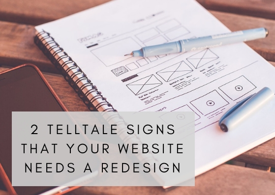
A website is an important marketing tool because it is a business’ online storefront. When people are surfing the web and come across a website, they judge it and determine whether that business is a good fit for them. There are quite a few reasons that might deter someone away from a website only to go to their competitors. One of the biggest reasons is that the site is out of date and needs a redesign. Additionally, there is more than one factor at play that can put a website into this category. Below, we’ve described two of the biggest telltale signs that a website needs a redesign.

It isn’t responsive.

Time and time again we’ve stressed the importance of having a responsive website. A responsive website has a flexible layout that is adaptable to different screen sizes and devices. For example, take a look at the three images below, each image has the same image, titles, and text despite being on three different devices.

Mobile Version
Image is a desktop screenshot of Old City Web Services' website.
Desktop Version
Image is a screenshot of the tablet version of OldCityWebServices.com.
Tablet Version

Now more than ever, people are using mobile devices and tablets to surf the web as much as a desktop, if not more. When users have a bad mobile experience on a website, they’re less likely to shop with that business. The proof is in the pudding, check out the statistics below to see how important a responsive website truly is.

  • 46% of people will not shop with a brand again if they had a bad mobile experience (Google, 2017)
  • 52.2% of worldwide online activity was generated through smartphones in 2018 (Statista, 2018)
  • 57% of mobile users will not recommend a brand with a bad mobile design (socPub)
  • 80% of mobile users are more likely to shop with a brand with a mobile website that answers their questions quickly (Google, 2018)
  • Consumers have twice as many interactions with brands on their smartphone than they do with brands on TV, in-store, etc. (Google, 2017)

(Source: Blue Corona)

Your competitors have newer sites.

Image contains a computer, a hand, and a pen.
If your competition’s website looks significantly newer than yours, it’s time for a redesign! Potential customers surfing the web will research a few businesses before making a final purchase. Part of their research is comparing you to your competitors. This includes the look and feel of your website. Generally, we encourage clients to redesign their website AT LEAST every five years. On the other hand, this recommendation may change based on the look and navigation of your competitor’s site. Although a two-year-old website may feel new to you, potential clients may not draw the same conclusion. Remember, a quality website represents a quality business. Periodically compare your website to your competitors. Check for a fast or slow load time, easy navigation, and how responsive your site is on a smartphone, desktop, and tablet.

Need A Redesign?

Don’t panic if your site isn’t responsive or if your competitors have newer sites. This is an easy fix. Depending on your needs, a new website can be designed in as short as a few weeks or as long as a few months. Of course, the quicker you get your website redesigned the better! If you have any questions about the redesign process, just give us a call or contact us today.

Use Good Phone Etiquette

One thing that is important for success in your business is using good phone etiquette. Answering the phone promptly within in one or two rings is a big plus. Use a friendly, welcoming tone; don't be abrupt or gruff. Put a smile on your face...it conveys in your voice. If you have to put the caller on hold, check back in with them - don't forget them. And, at the end of the call, be sure to "Thank" the caller. It goes a long way.


Mission Statement

Our mission at Old City Web Services is to navigate the world of web design, web development, and advertising for our clients so that they can focus on what they do best – running their business! Our business intentions go beyond the metrics of graphics, coding, and SEO. Located on Florida’s First Coast, we run a personable home front service and consider our relationship with our clients as a partnership in their success. If you are looking to increase your business’ visibility give us a call at 904-867-4112 or contact us today.

Sharing and re-posting this blog is encouraged. Please credit Old City Web Services when sharing. Photo credits: OldCityWebServices, Canva. Disclaimer: Every effort is made to ensure the accuracy of information on Old City Web Services Blog.[/fusion_builder_column][/fusion_builder_row][/fusion_builder_container]

Filed Under: Design, mobile-responsive website, Tips For Success

All About CMS WordPress

January 29, 2018 by anoadmin Leave a Comment

When a client asks us which content management system (CMS) is best for their online needs we always recommend WordPress. In fact, we even suggest that clients with a different software convert to WordPress. It is the easiest application for business teams to manage, its user-friendly and powerful software can support a variety of small and large businesses, and it is also cost-effective.

WordPress is an Open Source CMS

The two most popular types of CMSs are open source and custom.

CMS (content management system) - Software for your website that allows multiple users to manage website content.

Custom CMS -  A CMS that is built from the bottom up by a programmer and is costly. Pricing starts at around $5,000.

Open Source CMS - Software that is open to the public to create, edit, and transform. In most cases, no single individual owns an open source CMS, rather, a community of developers and programmers work on it simultaneously.

The most popular open source CMSs: WordPress, Joomla, and Drupal

CMS WordPressed benefits

WordPress offers more free plugins and themes. Overall it's more popular and has double the downloads than other CMSs. Photo from websitesetup.org.

Did you know that 29.3% of websites run on CMS WordPress?

User-Friendly Software

Back-end of CMS WordPress

Despite the complexity of designing and developing a website, business owners can make updates with ease to WordPress’s user-friendly software. Its back-end is structured with business owners in mind, unlike the back-end of Drupal and Joomla, which even developers have a difficult time using. This means that nearly anyone can make website updates and manage their own website. As you can see in the photo above, WordPress clearly lists a series of functions on the left-hand side of the dashboard.

However, the software alone is not enough for an effective website. Along with software, you will need a WordPress theme and plugins.

Plugins and Themes

WordPress has more free and budget-friendly themes.

A theme is the underlying functionality of a website. WordPress has a vast selection of responsive and quality themes. While some may require recurring fees, all themes require maintenance fees. However, WordPress offers twice as many quality themes than the competitor.

Check out these popular and responsive themes. See anything you like?

WordPress Theme
Theme: News/ Blogs/ Content Functionality
WordPress Theme
Theme: ECommerce Functionality
WordPress Theme
Theme: Property Booking Functionality

WordPress also has more plugins.

Plugins are functions that you can add to your website such as a calendar, a reservation bar, a scheduling bar, or to convert to an eCommerce site. CMS WordPress offers over 45,000 quality plugins, exceeding offers from Drupal or Joomla. Furthermore, their plugins are far less expensive than the competitors.

Despite the budget-friendly perks of using WordPress, maybe you find Drupal or Joomla's plugins and themes more attractive. Keep in mind, the themes and plugins available for these two CMSs are going to be just as difficult to navigate as their confusing software.

The photo below will give you a better idea of how difficult it is, for developers and website owners alike, to navigate the back-end of Drupal and Joomla. WordPress' software guides you in the right direction when you need to update your site, add/edit/delete products, add a service, or add imagery.

Backend of WordPress
WordPress
Backend of Joomla
Joomla
Backend of Drupal
Drupal

Unless you enjoy labyrinths,

call us today and we'll convert your website to a WordPress site.


Steve here from OCWS coming at you with my second Tip For Success!
First off - happy new year! I've got one BIG and SIMPLE tip to help you succeed online in 2018. It will help your business more than you can imagine. All you have to do is go to Google.com/MyBusiness, log in, and add as much information about your business as you possibly can.
You're probably thinking, "I did that years ago when I started my business!" If you did, that's great! But guess what? Google has made some changes since then. Google now allows you to add different types of information. The search engine then uses this information every day to serve up search engine results in interesting ways. I'm sure some changes have been made to your business since then and Google would LOVE to know.


Mission Statement

Our mission at Old City Web Services is to navigate the world of web design, web development, and advertising for our clients so that they can focus on what they do best – running their business! Our business intentions go beyond the metrics of graphics, coding, and SEO. Located on Florida’s First Coast, we run a personable home front service and consider our relationship with our clients as a partnership in their success. If you are looking to increase your business’ visibility give us a call at 904-867-4112 or contact us today.


Sharing and re-posting this blog is encouraged. Please credit Old City Web Services when sharing.
Disclaimer: Every effort is made to ensure the accuracy of information on Old City Web Services Blog.
Photo credits: Old City Web Services, WordPress

Filed Under: Community, Content Management System, mobile-responsive website, Tips For Success Tagged With: CMS, Drupal, Joomla, Open Source, Plug-Ins, Themes, User-Friendly, WordPress

7 Site Characteristics to Ditch

November 26, 2017 by anoadmin

As a business owner creating and managing a website can be difficult. Your expertise is in your business and not graphic design. However, a compelling website is just as important as a business manager. With the Christmas approaching, you'll want to be sure that visitors are captivated by your site because they have a limited attention span.

While holiday shopping, or preparing their own businesses for the holidays, the chances are that your visitor has a lot on their mind already, just like you! To ease their navigation issues, it is important to eliminate pesky site characteristics.

As a web design company, we urge you to consult with us with any of your web design issues. If two of these items are applicable to your site, we insist you call.

1. The site is not responsive.

If a website is not responsive visitors will have trouble viewing and searching for information. Text and photos that are designed for a desktop site appear small and difficult to read on a smartphone. Or, worst-case scenario, smartphone visitors will have to scroll up and down AND left to right - this can be frustrating.

Responsiveness is not a new concept. For years users have browsed the web using devices such as smartphones, laptops, and tablets. In fact, in November of 2016, mobile browsing surpassed desktop browsing.

2. Contact information is replaced with a form.

Did you experience an outage after hurricanes Matthew or Irma? If so, then you understand why it is irritating when a company doesn’t have their phone number and email address readily available on their website. Basically, it is only acceptable for Florida Power and Lights to hide their contact information from their customers.

Site Characteristics

Old City Web Services Contact Page is a good example to follow - it includes contact information and a contact form.

3. An irrelevant About Page.

As soon as a visitor lands on a site several things should be apparent to them, for example, the company mission. At this point, if there is any confusion on what services, products, or advice the company provides visitors will navigate to the About Page. If the About Page is still unclear and has a ton of script that doesn’t describe what the business is selling, providing, or producing the visitor will move on to the competitor's website.

An About page shouldn't be boring, but it should be informative.

4. Pages with too little text or too much text.

Website content should be balanced. If each page has a few sentences on it visitors won’t stick around long enough to get a full grasp of your product. In the same sense, visitors are unlikely to read an enormous block of text. Break up large blocks of text with headings and subheadings and combine pages that have only a few sentences of text.

5. Too many Popups.

Advertising and call to actions are important site characteristics and depending on the business, they are non-negotiable. However, if popups are stopping users from navigating to different pages or straight up pesky, chances are they will opt-out of a site faster then they opt-out of spam emails.

Site Characteristics

6. Information is hard to find.

Websites should not resemble mazes - but sometimes they do. Information for visitors needs to be plentiful and well-placed. Large blocks of content, missing details, or missing prices will only frustrate site users and lead them elsewhere. For example, if you are a historic inn or bed and breakfast then your website should include prices, amenities, and the location of your business. Focus on which aspects are most important for your potential customers and be sure to add it to the website.

7. It is messy.

Websites that are eyesores are less likely to engage visitors for long periods of time. Eyesores can include different font styles, mismatched color combinations, blurry or too many photos and random placement of photos. This may seem petty, but if a website is tacky chances are so is the product.

When in contact with your customers or the public, it is extremely important to provide quality customer service.  A friendly, courteous disposition goes a long way.  That includes answering the phone with a smile on your face; it can be heard in the tone of your voice.  Put the shoe on the other foot and treat your customers the way you would want to be treated.


Mission Statement

Our mission at Old City Web Services is to navigate the world of web design, web development, and advertising for our clients so that they can focus on what they do best – running their business! Our business intentions go beyond the metrics of graphics, coding, and SEO. Located on Florida’s First Coast, we run a personable home front service and consider our relationship with our clients as a partnership in their success. If you are looking to increase your business’ visibility give us a call at 904-867-4112 or contact us today.


Sharing and re-posting this blog is encouraged. Please credit Old City Web Services when sharing.
Disclaimer: Every effort is made to ensure the accuracy of information on Old City Web Services Blog.
Photo credits: Old City Web Services

Filed Under: General, mobile-responsive website, Tips For Success, Web, Website Design Tagged With: About Page, Popups, Responsiveness, Website tips

Old City Web Services Launches New Website!

June 15, 2016 by anoadmin Leave a Comment

website

WE HAVE AN ANNOUNCEMENT !

We are very excited to show off our new website here at Old City Web Services! Everything has been updated from images for the website, the "About" section to our portfolio. Not only is it responsive on any device, but it's also easier to navigate through our site. So go explore our new site, and click on everything! See what Old City Web Services can do for your business!

We recognize we have to update our website, Is it time to update yours?
Contact Us Today to Get Started!

Filed Under: Advertising, Content Management System, Content Marketing, General, Marketing, mobile-responsive website, News, Search Engine Optimization, Small Business Marketing, Social Media Marketing, Special Message, Website Design

New Year, New Look: Update Your Website

January 5, 2016 by anoadmin

 is a new year - a great time to start fresh for your business. One way to start the year off on the right foot for your business is to give your website a fresh new look, and make sure that your website is optimized to keep up with today's web design and development trends.

So many current and potential customers to your business will be finding you on the internet if they haven't already. It is absolutely imperative in 2016 to keep up with internet trends, and having a website that shows you put care and time into all aspects of marketing your business.

Mobile Friendly - in early 2015, Google started penalizing websites that aren't mobile friendly in their rankings. If you didn't make the change then, it is a good idea to do it now. It's never too late to make the changes necessary to keep potential customers finding your business as they search the internet for their needs. Contact us today so we can make your current website mobile friendly!

Design Trends - keeping up with design trends doesn't mean you have to be trendy and change every year. What it does mean is keeping the look of your business up-to-date and eye-catching for the internet. Having a web design with large, professional photography and going easy on the text content while still getting your message across is important. Contact us today so we can help guide you through the process of a new design that will showcase your business and keep your website up-to-date.

Content Management System - If you haven't built your website yet or moved your current website into a content management system, now is the time. 2016 is the time to streamline and simplify where you can, and your website is a great place to start. In a content management system like WordPress, editing and adding to your website is fast and easy. The investment is worth it. Contact us today to build your site in WordPress to get your business off on the right foot in 2016!


Filed Under: Design, Marketing, Mobile Website, mobile-responsive website, Responsive Web Design, Website Design

Why You Need Responsive Design

November 3, 2015 by anoadmin Leave a Comment

What is responsive design? Responsive web design is an approach that addresses a user’s needs based on the environment they are in when viewing your website. Whatever screen size, platform or orientation they are using – as they switch from their phone to their desktop to their ipad, the website adjusts to accommodate for resolution and sizes.

Why do you need responsive design?


Customer Expectation

It is expected in today's internet world that when a visitor arrives, they be able to navigate easily, find a mobile friendly menu, easy to find contact information, and a website that caters to the device they are using. If your website isn't meeting this expectation, it will look out of date and visitors may find it cumbersome and too difficult to make it worth their while to stay on your website.

It Helps Build Your Brand

Appealing design and function for a business website will help it grow. Neglecting proper branding will hurt it. Once a client has a bad website experience, it will affect their opinion of you as a business and it can be difficult to repair that image.


Sheer Numbers

Mobile websites that respond to the user environment isn't a trend. It is the way things are. It isn't something you can ignore until things go back to the way they were. It is vitally important to your small business that you stay up to date in online needs.


Filed Under: Mobile Applications, Mobile Website, mobile-responsive website, Responsive Web Design, Website Design

Mobile Marketing in 2015

March 18, 2015 by anoadmin Leave a Comment

The most important thing business owners are going to need to focus on in 2015 is mobile website optimization. Whether you already have a mobile strategy in place or you're just now putting together a website and monitoring your mobile statistics, the statistics are very clear-mobile is going to be bigger than ever.

Did you know that over half of all mobile searches lead to a purchase? And that 50% of millennials use their smart phones to research products or services while shopping, and 41% have made purchases using their phones? This makes it incredibly important to focus on mobile marketing in 2015.

Here are some things to do to make sure you can capitalize on this area of your client-base:

  •          Build an App or Custom Mobile Site - When a customer is using your mobile app, 46% of them are less likely to shop your competition. If you have them honed in on your business' site, they are more likely to spend their money with you. Unique clicks are 15% greater on mobile optimized websites. This makes it money well spent for you to have a custom app built or a custom mobile website created to enhance the customer's experience with your business.
  •          Optimize for Tablets, Too - Tablets have become and are continuing to be extremely popular as users are on the go but want more function than just their smart phone. Looking at your site statistics will show you how high the mobile user rate is and how many of those users are tablet users. This alone should be motivation enough to optimize your site for tablet screens.
  •          Create Call-To-Action Buttons - when users come to your site on a mobile device, they are there for a very specific reason - they want your phone number, your location, your sales and deals, maybe a coupon, a menu. Make all of these things extremely easy to find so the user can get the information quickly and easily. This will keep the customer around because their experience on your site was a pleasant one.

Optimizing your mobile website in 2015 is a project that will bring immediate results to your business. We are happy to help with creating a mobile site that will be highly functional, aesthetically appealing, and easy to use for the mobile web viewer.


If you'd like for us to help you in taking your business to the next level, call us (904.829.2772) or e-mail us and we will be happy to offer our services!

Filed Under: Marketing, Mobile Website, mobile-responsive website

3 Choices for Your Mobile Website

October 29, 2014 by anoadmin

This is becoming a mobile world. Everywhere you turn, it seems people are using their phone or mobile device when they need information. It is imperative today to have a website that keeps up with this trend and fills the needs of customers who are looking for information on their mobile device rather than their computer screen.

Over 30% of website traffic now comes from mobile devices. While sales from mobile devices only make up 15% of total sales, mobile users are still very important for brand awareness and informational purposes. Since mobile users are generally on the go, they are often quickly coming to your site for key information - location, hours, directions, phone number - and having your mobile site provide that information quickly and in a streamlined manor can result in business down the road.

You have 3 choices when it comes to making your website work with mobile technology and all three serve different purposes and can help your business grow.

1.     Mobile-Friendly - a mobile friendly website is your website as it renders on a computer screen. It correctly displays your website on the smaller screens of mobile devices. This is not specifically designed for mobile devices but users will still be able to navigate though not as easily as with other types.

2.      Mobile Responsive - a mobile responsive website design is more widely used today than ever before.  The basics are that the same design will work on a computer or mobile device and the design will respond to the varying conditions of the user's device. For example, phone numbers and addresses can be clicked for calling or directions.

3.      Custom Mobile - Overly complex sites that have a lot of information on them are best served by having a custom mobile version of their site. When a user comes to the site, it is detected whether they are on a computer or mobile device and the corresponding version of the site is displayed. This type of mobile version is optimal because the experience can be customized by removing some content or features or add others that mobile users will require which a computer user wouldn't.

Regardless of which type of mobile experience you want to offer your users, having a website that is user-friendly and streamlined for the increasing number of mobile users is essential to your business' growth.


Filed Under: Mobile Applications, Mobile Website, mobile-responsive website

Responsive Web Design- what it is & why you need it

September 4, 2013 by anoadmin

Responsive Web Design is a web design approach targeted at crafting sites to provide an optimal viewing experience-- easy reading and navigation with minimum resizing, panning and scrolling across a wide range of devices (from mobile phones to desktop computer monitors).

When developing a new website for your business or redesigning your outdated existing site, it is crucial to make sure it has a responsive design. Drew Thomas, Chief Creative Officer and co-owner of Brolik, a global digital agency, reinforces this argument in an article titled, Why Responsive Web Design Has To Win Out. Thomas says, "The most important metric is how functional the website is for the user. . . Mobile and desktop websites should be easily found, easily shared, fast loading, easy to maintain and easy to build on."

Old City Web Services specializes in responsive web design and we provide the highest level of responsiveness to our clients, insuring that each design will work well on multiple digital platforms. We guarantee web designs that fall in line with the responsive web design standards. Test your website by bringing it up on various mobile devices, desktops, laptops and web browsers (Internet Explorer, Firefox and Google Chrome). Does it appear user-friendly and remain consistent throughout?

Need help determining whether or not your website has a responsive web design? Concerned that visitors are not getting the best experience while on your site?

Contact us today by giving us a call: 904.829.2772 or emailing us: werespond@oldcity.com to schedule a free consultation.

Filed Under: Design, Mobile Website, mobile-responsive website, Responsive Web Design, Website Design

  • 1
  • 2
  • Next Page »
See our work
Call us: 904-867-4112
old city web services footer logo

  • Home
  • Services
  • About
  • Portfolio
  • Contact
  • Privacy Policy
  • Sitemap

We are Old City Web Services. We make it easy for small businesses to thrive online. Whether you need a professional website, help attracting more customers, or a fresh new look for your brand, we’ve got you covered. With over 20 years of experience, we specialize in simple, affordable solutions that work for businesses like yours. Let us handle the tech so you can focus on what you do best—running your business.

stjohns logo

© 2025. Old City Web Services. All Rights Reserved.