Old City Web Services

Old City Web Services

  • Home
  • Services
    • Web Design and Development
    • Digital Marketing
    • Graphic Design
    • WordPress Training
    • Web Maintenance Services
  • About
  • Portfolio
  • Contact

Mobile Responsive: HOW it Effects Your Website

June 11, 2020 by anoadmin

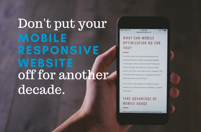
What is a mobile responsive website?

A mobile responsive website simply means that the website can be easily navigated on a mobile phone, tablet, and desktop. Responsive websites have the ability to adjust their size, layout, and proportions to be readable across devices.

Image is a screenshot of OldCity.com's mobile responsive design.

Mobile Responsive: HOW it Affects Your Website

The first time we mentioned the importance of a mobile responsive website was nearly one decade ago. Oh, how time flies! All these years later, this topic is more important than ever.

Unresponsive websites are at risk of losing half of their traffic.

From May of 2019 to May of 2020, roughly 50% of web users were browsing on mobile devices. With this information, we can assume that nearly 50% of the users on our clients’ websites are on a mobile device. So, if your website isn’t responsive, you are at risk of losing half of your website traffic!

Find out how many users are on a mobile device on your website via Google Analytics.

Picture this: You are on vacation and headed out for a day of fishing. But first you need to pick up bait, so you do a Google search for ‘nearby bait shops’.

Among your search results is a locally owned bait shop. Since you would prefer to spend your money locally, you click the link to their website. Next, you head to their Products Page to find out if they carry – wait a minute. You can’t find their Products Page. In fact, you can’t find anything on the website without scrolling left to right and up and down because it is not a mobile responsive website. Frustrated that you can’t find answers, you’ll scroll to the next bait shop.

Need more convincing that you need a mobile responsive website? Keep scrolling!

The Benefits of A Mobile Responsive Website

Here are a few of the perks of a mobile responsive website:

  • Users on a mobile device or tablet can easily find the Navigation (this is at the top of the website where the Home Page, Contact Us Page, and other pages are located). A mobile responsive website also allows them to easily find other information and view images better.
  • Search engines (like Google) reward mobile-responsive websites with a higher SEO (search engine optimization) score. You can learn more about how SEO and mobile responsive websites correlate here.
  • The Exit Rate (the percentage of times people leave your website too quickly) is lower. If your Exit Rate is high it’s likely because users aren’t having a good experience on it; not having a responsive website hugely contributes to a bad user experience on a site.

The Downfall of Unresponsive Websites

Since more people use mobile devices to browse the internet, mobile responsive design was created to provide a better user experience. Your website serves as an online marketing tool and a bad user experience is detrimental to how effective it is. Think of it like this: browsing an unresponsive site is similar to trying to find an item in a store with no aisles, no signs, and no employees.

  • There is inadequate space to click on links, so the user has trouble getting information. Have you ever tried to click on a button on your phone but kept missing it? This is what the entire experience feels like on an unresponsive website.
  • Users are constantly having to zoom out to find information and then zoom in to read it. Talk about inconvenient!
  • Instead of scrolling up and down, users have to scroll up, down, left, and right.

For a good example of a mobile responsive website, check out this blog on a mobile phone. Not only is OldCityWebServices.com a responsive site, but the layout of this blog was also intentionally designed to be user-friendly on a mobile phone.

Don’t put this off for another decade!

We understand that life gets busy, but this can’t wait! If your website isn’t mobile responsive, we guarantee that a mobile responsive design will astronomically improve the efficiency of your website. Remember, your website’s purpose is to be a marketing tool that works for you!

Call us at 904-867-4112 or click the button below to fill out our form.

Let’s get started!

Mission Statement

The mission at Old City Web Services is to navigate the world of web design, web development, and advertising for our clients so that they can focus on what they do best – running their business! Our business intentions go beyond the metrics of graphics, coding, and SEO. Located on Florida’s First Coast, we run a personable home front service and consider our relationship with our clients as a partnership in their success.

Please share and re-post this blog. Disclaimer: Every effort is made to ensure the accuracy of the information on Old City Web Services Blog.

Filed Under: Design, Mobile Website, mobile-responsive website, Responsive Web Design, Website Design

The Evolution of Websites

January 17, 2020 by anoadmin

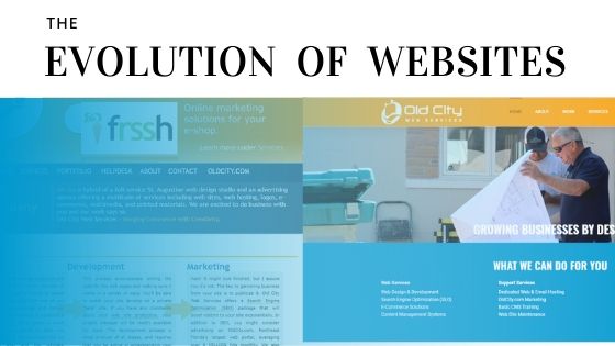
The evolution of websites has featured significant advancements since the creation of the world wide web in 1989. In fact, every few years there are enormous technological changes in the way they look and how we use them. While comparing the look of old websites to websites today can be a fun walk down memory lane, it also sheds a light on how quickly websites can go from ‘on trend’ to outdated. While we hope this blog is interesting, we also hope it highlights how important it is to keep up with the Joneses (and your competitor) by redesigning your website every few years!

Evolution of Websites from 1990 to 2000:

Having been created in 1989, the world wide web was just starting out when our timeline begins in 1990. In fact, was 1991 when the first website would be created and today, it is hardly recognizable as it only had a single column of text.

Once websites became more popular, they would make leaps and jumps in appearances. In fact, two noteworthy advancements between 1990 and 2000 include the creation of table-based sites and a new software called Flash. While table-based sites were substantial because they made it possible to create websites with multiple columns, Flash was equally as unique because it gave websites the ability to have videos, music, and graphics with animation. Both advancements significantly changed the appearance of websites as well as promoted better user-experience and content organization.

Websites from the ’90s: OldCity.com (1998), Nascar.com (1996), CountryLiving.com (1997).

Fun facts during this time:

  • Splash pages became a fad among designers. A splash page was a page that users hit before hitting the main website; designers added logos and moving graphics or text to catch the eye of the user.
  • Background images, animated text, scrolling text, and GIFs became popular across websites.
  • Website page builders became available to anyone with an internet connection and allowed them to build their own websites. Examples of these programs include Angel Fire and GeoCities.

Evolution of Websites from 2000 to 2010:

In the early 2000s, a programming language called CSS (cascading style sheets) became a widely popular way to build websites. At this time, CSS was used in conjunction with HTML which is another popular programming language. While only using HTML mandated creators to code each individual element on a website, the combination of CSS and HTML allowed creators to define elements across a website. Instead of writing out an entire website, creators could write the code for elements once (title sizes, colors, header images, etc.) and have it mimicked across the website.

JavaScript is another programming language that became popular at this time and is useful in a completely different way. In fact, its biggest superpower is that it can add animation to a website that doesn’t need to be read by a secondary program. Up until this time, Flash was pretty much exclusively used to add animation to a website. However, animations built with Flash could only be read with the program Flash Player and not every computer had it.

CSS and JavaScript gave creators more wiggle room and layout capabilities. As a result, the world wide web was seeing more websites using animated buttons and call-to-actions to interact with users as well as websites with uniformity, sleeker layouts, and more organized content.

Websites from 2005: OldCity.com, Nascar.com, and CountryLiving.com.

Fun facts during this time:

  • In 2003, Microsoft Internet Explorer 5 became the first web browser to support more than 99% of CSS websites with no glitches or loading errors.
  • In 2004, Facebook (formerly TheFacebook) launched for the first time.
  • The first version of Google’s popular website browser, Chrome, was created in 2008.

Evolution of Websites from 2010 to 2020:

Although internet access on a mobile phone was available prior to 2010, it was in the years after 2010 that mobile responsive design became a priority for websites. This resulted in progressively minimal websites. For example, instead of getting the attention of users with flashy designs, designers began to focus on layouts that were tall and skinny. This ideology helped the experience on a mobile phone be just as delightful as that on a desktop.

Furthermore, although it can be argued that websites have been optimized for search engines for decades, it wasn’t until the few years before 2010 that creators began to competitively add it to their marketing strategy. As a result, the content of a website became about SEO and therefore, design became about the layout of the content. This only further stressed the importance of a bare-minimum layout. Soon thereafter, more and more websites were redesigned to have reduced navigation of only the main areas of the website, images that shrink on smaller devices, as well as content that gets straight to the point of the website.

OldCity.com (2012), Nascar.com (2015), and CountryLiving.com (2015)

Fun facts during this time:

  • In 2016, the number of people browsing the internet on a smartphone surpassed the number of people browsing the internet on a desktop.
  • The programs Facebook, Mozilla, Google, Apple, and Microsoft have stopped supporting Flash Player because of its vulnerability.
  • There are 1,742,651,546 websites online as of January 15, 2020.
null

Don’t get left behind, get a redesign!

Websites are changing faster than ever and it’s only a matter of time until newer trends like mobile responsiveness are old news. Additionally, people can tell if your website looks a decade, or even a half a decade old. So, don’t get left behind! Instead, let us give your website a facelift with a redesign. After all, the number of consumers that shop, plan, and research on the internet is only rising.

Press the button below or call us at 904-867-4112 to get started on a redesign that will make your business shine.

Have a redesign in mind?

Sources: EZ Marketing, HubSpot, Neil Patel, Pew Research, Search Engine Journal

Mission Statement

The mission at Old City Web Services is to navigate the world of web design, web development, and advertising for our clients so that they can focus on what they do best – running their business! Our business intentions go beyond the metrics of graphics, coding, and SEO. Located on Florida’s First Coast, we run a personable home front service and consider our relationship with our clients as a partnership in their success.

Please share and re-post this blog.  Disclaimer: Every effort is made to ensure the accuracy of the information on Old City Web Services Blog.

Filed Under: Design, Marketing, Mobile Website, Search Engine Optimization, Web Development, Website Design

3 Restaurant Plugins All Restaurants Need

March 16, 2018 by anoadmin Leave a Comment

3 Restaurant Plugins All Restaurants Need

Years ago, restaurants relied solely on word-of-mouth (one of the most difficult and best ways to advertise,) to promote their business. However, that changed when smartphones became as common as wallets. Now, everyone from teenagers to elders has unlimited access to information at the click of a button, the internet.

Since 85% of people search for local businesses online, it is important that your website reflects how great your business is; you can have a supreme product and establishment, but, customers won’t visit you unless your site is up to par as well. Each niche is a little different but, when it comes to restaurant plugins these are the three your site needs to give customers a satisfying online experience during the research portion of their path-to-purchase.

1. A Customizable Menu Plugin

Restaurant Plugin Desktop Version
Panera Bread’s Desktop Menu Restaurant Plugin
Restaurant Plugin Mobile Version
Panera Bread’s Mobile Menu Restaurant Plugin

There are no ifs when’s, or buts - the most important restaurant plugin to have is a customizable menu that is mobile-friendly.

In fact, 70% of consumers say it’s important that they're able to read the menu of a restaurant on their smartphone and 62% of consumers won't visit the restaurant if they can’t. Customizable menu restaurant plugins are mobile-friendly, include description spaces, and the option to add several photos to one menu item. Furthermore, you can choose to have your products set up as a grid, one column, or several columns depending on the layout of your site!

Note: Many restaurants will create a PDF file for their menu or hire a third-party company that creates their menu and provides them with a link (under a different domain,) that they can add to the restaurant's site. These are not good alternatives because PDF files are difficult to view on smartphones and users do not trust being tossed from site to site.

(Source)

2. A Google Map Plugin

Google Map Plug-In

A Google Map plugin that allows customers to easily locate your business.

When looking for places to eat, most people research local restaurants looking for two things; the type of food they serve and their location; making Google Maps the second most important restaurant plugin to have.

A study by GroundTruth found that 64% of people who searched for food on their smartphone visited or purchased food online within an hour of their search. This means that location is an essential factor for consumers because the 64% of people in this study were no further than an hour from where they purchased food. Hence the two frequently searched terms “nearby restaurants” and “restaurants near me.”

By adding a Google Map plugin to your site, you are lessening the steps a consumer must take to get to your restaurant and enhancing your chances of gaining a customer.

(Source)

3. A Plugin for Reviews

La Fiesta Review Restaurant Plugin

Review Plugin on La Fiesta Ocean Inn & Suites' Site

Since restaurants lead the pack of businesses in which the most reviews are read, review plugins are growing increasingly popular! Once consumers land on your website, reading good reviews by other consumers is a sure way to earn their trust because 85% of consumers consider reviews as trustworthy as personal recommendations.

Why not show off your great customer service and unparalleled products through a review plugin? After all, 73% of consumers trust a local business more after seeing good reviews.

(Source)

Whether you run your site on WordPress, Joomla, or Drupal,

all restaurant sites have access to and need these restaurant plugins.

Did You Know?

Mobile Pay is becoming an increasingly popular method of payment. Restaurants like it because it lessens the tasks of their waiters. Consumers enjoy its convenience! In fact:

  • 58% of consumers sometimes or always use mobile pay at a restaurant.
  • 22% of restaurants now offer Mobile Pay through an app!
  • 44% of millennials prefer a digital receipt to a paper receipt.
  • 73% of consumers agree that restaurant technology improves their dining experience.
  • 30% of adults are more likely to use restaurant technology than two years ago.

(Source)

We'd love to hear your thoughts on Mobile Pay. Is it the way of the future? Or is it not worth the hassle? Leave your answer in the comments below!

Contact Forms and Responding to Emails

Do you have a contact form on your website? Are you the only one that is set up to receive it? What happens when you go on vacation, are out sick, or have a family emergency?
Here at Old City Web Services, our contact form is set up so that each inquiry is forwarded to three people. This ensures that our client is taken care of even if someone is out for the day or on vacation. It's imperative to respond to your clients in a timely manner because if they don't hear from you right away, they may move on to your competitor. Need help adding employee emails to your contact form? Give us a call or fill out our form!


Mission Statement

Our mission at Old City Web Services is to navigate the world of web design, web development, and advertising for our clients so that they can focus on what they do best – manage their business! Our business intentions go beyond the metrics of graphics, coding, and SEO. Located on Florida’s First Coast, we run a personable home front service and consider our relationship with our clients as a partnership in their success. If you are looking to increase your business’ visibility give us a call at 904-867-4112 or contact us today.


Sharing and re-posting this blog is encouraged. Please credit Old City Web Services when sharing.
Photo credits: Panera Bread, Rodbender Fishing Charters, La Fiesta Ocean Inn & Suites.
Disclaimer: Every effort is made to ensure the accuracy of information on Old City Web Services Blog.

Filed Under: Mobile Plug-In, Mobile Website, Plugins, Responsive Web Design, Tips For Success Tagged With: Google Map Plugin, Menu Plugin, Restaurant Plugins, Restaurant Web Services, Review Plugin

5 Mistakes Not to Make in WordPress

January 27, 2016 by anoadmin

helpBuilding a website isn't as easy as it looks. There are a lot of things that go into the background of a website, in addition to the design and layout and basic functions. Often, there are things that are overlooked if you don't go with an expert to build your website for you.

Making Life Difficult for Mobile Users: Having a website created today that isn’t mobile friendly is a surefire way to lose site visitors, along with Google Rank. It may sound easy enough, but it isn’t. Our expertise at Old City Web Services can have your current or new site functioning for mobile users quickly and seamlessly.

Not Using Google Analytics: You can’t possibly know how to drive content to your site or how your web site is performing without having stat tracking set up on your website. Google Analytics is an easy way to track and simple reports can be generated that will help you strategize website updates and changes. We can help you install Analytics and understand your reports. Call us today to get you started!

Ignoring WordPress Updates: Having an out of date version of WordPress can leave your website vulnerable. Updating your WordPress version isn’t a complicated task, but running a backup before you update can be. We can set you up on a plan to run updates and keep everything running smoothly on your site in the background on a quarterly basis. Contact us today to find out how to get started!

Not having a Contact Form: A contact form is easy to set up, and easy for visitors to use. Although you may have your email atypingddress on your site handy, that assumes that the visitor has an email client set up on their device to use it. It’s much more user-friendly to have a form that will send the email right to you after they fill it out. This also gives you a record of entries so you can look them up if you lose an email.

Ignoring SEO Settings: You won’t want to ignore the SEO settings for posts and pages. It is not enough to just install a plugin for SEO and then do nothing. You should still proactively update your meta settings among other things.

All of these are things that we can help with on your current site or help you avoid by creating your site for you. Contact us today to help you maximize your website’s potential.

Filed Under: Content Management System, Mobile Website, Website Design

Optimize Your Website for Conversions

January 19, 2016 by anoadmin

 Whether you have a website that needs updating or you are creating a new website, the best place to start is with asking yourself what the ultimate objective is. The answer probably falls somewhere along the lines of that you want it to look good and get results.

Conversion optimization is all about the action a site visitor takes on your website that will add value to your business. Conversion is anything from signing up for your newsletter, purchasing an item, booking a service, or clicking to call you. Optimization of conversions requires analysis of your website to maximize the leads your website brings in.

There are multiple ways you can maximize your website for conversions: High Quality Photography: One of the most basic things with big impact on your website is photography. Whether you are selling a product, a hotel room, or just want to show that your business is professional – nothing will draw viewers in and keep them clicking on your services like well presented photography. Mobile Optimization: Make it easy for viewers to your website to call you, make a purchase, reserve a room or a meal, or to find where you are located so they can walk in. This means making your site work for everyone no matter what device they are using to find your website. Mobile friendliness is absolutely imperative today, and will increase your conversions, improving your bottom line.

Call-to-Action Buttons: Give site visitors something to act on. A call-to-action button grabs attention and directs the site viewer to what they want to do on your site. These will help streamline user experience and increase your website's clicks and conversions for your targeted goals.

Contact us today to help you bring your site to it's maximum potential and to increase your website conversion rate.


Filed Under: Content Marketing, Marketing, Mobile Website, Small Business Marketing, Website Design

New Year, New Look: Update Your Website

January 5, 2016 by anoadmin

 is a new year - a great time to start fresh for your business. One way to start the year off on the right foot for your business is to give your website a fresh new look, and make sure that your website is optimized to keep up with today's web design and development trends.

So many current and potential customers to your business will be finding you on the internet if they haven't already. It is absolutely imperative in 2016 to keep up with internet trends, and having a website that shows you put care and time into all aspects of marketing your business.

Mobile Friendly - in early 2015, Google started penalizing websites that aren't mobile friendly in their rankings. If you didn't make the change then, it is a good idea to do it now. It's never too late to make the changes necessary to keep potential customers finding your business as they search the internet for their needs. Contact us today so we can make your current website mobile friendly!

Design Trends - keeping up with design trends doesn't mean you have to be trendy and change every year. What it does mean is keeping the look of your business up-to-date and eye-catching for the internet. Having a web design with large, professional photography and going easy on the text content while still getting your message across is important. Contact us today so we can help guide you through the process of a new design that will showcase your business and keep your website up-to-date.

Content Management System - If you haven't built your website yet or moved your current website into a content management system, now is the time. 2016 is the time to streamline and simplify where you can, and your website is a great place to start. In a content management system like WordPress, editing and adding to your website is fast and easy. The investment is worth it. Contact us today to build your site in WordPress to get your business off on the right foot in 2016!


Filed Under: Design, Marketing, Mobile Website, mobile-responsive website, Responsive Web Design, Website Design

Email Marketing and Landing Pages

December 1, 2015 by anoadmin

It is December and that means it is time for your small business to get serious about promoting your holiday sales and specials that you have going on. Email makes up over a third of the ways that consumers make holiday buying decisions.

The most important factor in your promotional emails is that they lead somewhere. In your promotional email, you need to send potential customers to a great landing page.

This can mean setting up a new page or editing a current one on your website.

The page should be catered to your sale, prices, promotion, or special that you are trying to convert customers with.

Some tips:

  • Make it mobile - it is safe to assume that many potential customers are on a mobile device when they are opening their email. The page you send them to telling them about your promotion has to be one they can navigate and read on their mobile device.
  • Keep it simple - the page you send them to should be dedicated to just the sales goal you have. Don't make it more complicated by giving them other distractions. A single page with a single goal will result in the highest conversion.
  • The elements - Stick to an attention grabbing headline and one great image.
  • Clickable call to action - give them one button to click that tells them what to do. That's it.

Follow these tips and your holiday sales are bound to increase. Need help creating a great landing page or formulating the perfect email? Contact us and we can help you today!

Filed Under: Content Marketing, email marketing, Landing Pages, Marketing, Mobile Website, Small Business Marketing

Why You Need Responsive Design

November 3, 2015 by anoadmin Leave a Comment

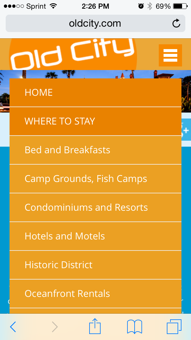
What is responsive design? Responsive web design is an approach that addresses a user’s needs based on the environment they are in when viewing your website. Whatever screen size, platform or orientation they are using – as they switch from their phone to their desktop to their ipad, the website adjusts to accommodate for resolution and sizes.

Why do you need responsive design?


Customer Expectation

It is expected in today's internet world that when a visitor arrives, they be able to navigate easily, find a mobile friendly menu, easy to find contact information, and a website that caters to the device they are using. If your website isn't meeting this expectation, it will look out of date and visitors may find it cumbersome and too difficult to make it worth their while to stay on your website.

It Helps Build Your Brand

Appealing design and function for a business website will help it grow. Neglecting proper branding will hurt it. Once a client has a bad website experience, it will affect their opinion of you as a business and it can be difficult to repair that image.


Sheer Numbers

Mobile websites that respond to the user environment isn't a trend. It is the way things are. It isn't something you can ignore until things go back to the way they were. It is vitally important to your small business that you stay up to date in online needs.


Filed Under: Mobile Applications, Mobile Website, mobile-responsive website, Responsive Web Design, Website Design

Mobile Marketing in 2015

March 18, 2015 by anoadmin Leave a Comment

The most important thing business owners are going to need to focus on in 2015 is mobile website optimization. Whether you already have a mobile strategy in place or you're just now putting together a website and monitoring your mobile statistics, the statistics are very clear-mobile is going to be bigger than ever.

Did you know that over half of all mobile searches lead to a purchase? And that 50% of millennials use their smart phones to research products or services while shopping, and 41% have made purchases using their phones? This makes it incredibly important to focus on mobile marketing in 2015.

Here are some things to do to make sure you can capitalize on this area of your client-base:

  •          Build an App or Custom Mobile Site - When a customer is using your mobile app, 46% of them are less likely to shop your competition. If you have them honed in on your business' site, they are more likely to spend their money with you. Unique clicks are 15% greater on mobile optimized websites. This makes it money well spent for you to have a custom app built or a custom mobile website created to enhance the customer's experience with your business.
  •          Optimize for Tablets, Too - Tablets have become and are continuing to be extremely popular as users are on the go but want more function than just their smart phone. Looking at your site statistics will show you how high the mobile user rate is and how many of those users are tablet users. This alone should be motivation enough to optimize your site for tablet screens.
  •          Create Call-To-Action Buttons - when users come to your site on a mobile device, they are there for a very specific reason - they want your phone number, your location, your sales and deals, maybe a coupon, a menu. Make all of these things extremely easy to find so the user can get the information quickly and easily. This will keep the customer around because their experience on your site was a pleasant one.

Optimizing your mobile website in 2015 is a project that will bring immediate results to your business. We are happy to help with creating a mobile site that will be highly functional, aesthetically appealing, and easy to use for the mobile web viewer.


If you'd like for us to help you in taking your business to the next level, call us (904.829.2772) or e-mail us and we will be happy to offer our services!

Filed Under: Marketing, Mobile Website, mobile-responsive website

3 Choices for Your Mobile Website

October 29, 2014 by anoadmin

This is becoming a mobile world. Everywhere you turn, it seems people are using their phone or mobile device when they need information. It is imperative today to have a website that keeps up with this trend and fills the needs of customers who are looking for information on their mobile device rather than their computer screen.

Over 30% of website traffic now comes from mobile devices. While sales from mobile devices only make up 15% of total sales, mobile users are still very important for brand awareness and informational purposes. Since mobile users are generally on the go, they are often quickly coming to your site for key information - location, hours, directions, phone number - and having your mobile site provide that information quickly and in a streamlined manor can result in business down the road.

You have 3 choices when it comes to making your website work with mobile technology and all three serve different purposes and can help your business grow.

1.     Mobile-Friendly - a mobile friendly website is your website as it renders on a computer screen. It correctly displays your website on the smaller screens of mobile devices. This is not specifically designed for mobile devices but users will still be able to navigate though not as easily as with other types.

2.      Mobile Responsive - a mobile responsive website design is more widely used today than ever before.  The basics are that the same design will work on a computer or mobile device and the design will respond to the varying conditions of the user's device. For example, phone numbers and addresses can be clicked for calling or directions.

3.      Custom Mobile - Overly complex sites that have a lot of information on them are best served by having a custom mobile version of their site. When a user comes to the site, it is detected whether they are on a computer or mobile device and the corresponding version of the site is displayed. This type of mobile version is optimal because the experience can be customized by removing some content or features or add others that mobile users will require which a computer user wouldn't.

Regardless of which type of mobile experience you want to offer your users, having a website that is user-friendly and streamlined for the increasing number of mobile users is essential to your business' growth.


Filed Under: Mobile Applications, Mobile Website, mobile-responsive website

  • 1
  • 2
  • Next Page »
See our work
Call us: 904-867-4112
old city web services footer logo

  • Home
  • Services
  • About
  • Portfolio
  • Contact
  • Privacy Policy
  • Sitemap

We are Old City Web Services. We make it easy for small businesses to thrive online. Whether you need a professional website, help attracting more customers, or a fresh new look for your brand, we’ve got you covered. With over 20 years of experience, we specialize in simple, affordable solutions that work for businesses like yours. Let us handle the tech so you can focus on what you do best—running your business.

stjohns logo

© 2025. Old City Web Services. All Rights Reserved.